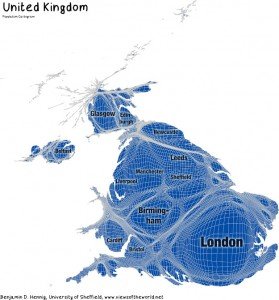
The UK as a cartogram

I sometimes wonder whether the physical size of Scotland is making Scots blind to the fact that Scotland’s influence in the UK is based on population, not on landmass: Scotland has only 59 out of 650 seats in the House of Commons.
To avoid this pitfall I often find it instructive to look instead at a cartogram, such as the one on the right. The size of the blue squares depend on the population living there, so London is a huge circle full of big squares. Sparsely inhabited areas are so small that they look like white lines instead. For instance, the white border around London means very few people are living in this “border area”.
From a Scottish perspective, we can see that Scotland is separated from England by a lot of white lines. In other words the Borders are almost empty, and this creates a very real border between the two countries. (We see a similar situation in Wales, and to some extent in Cornwall.)
More importantly, Scotland is clearly much smaller than London on this cartogram. This explains why the UK is increasingly being run by and for London, while Scotland struggles to get its voice heard.
Three hundred years ago, when the Union was formed, a cartogram would have shown a much more balanced map. Unfortunately, people (and money) have gradually gravitated towards the capital.
We need to rebalance the map, and the best way to achieve that is to vote for independence next year.
There are white lines between London and Sussex. I will use this map for my campaign too.
Isn’t part of Sussex inside of the London “bubble” these days? I’m not terribly strong on English geography.
No, definitely not!
Greenbelt.
OK. Could you try and colour in Sussex on the cartogram?
I’ve coloured in urban Sussex. There’s a big wodge of countryside between the bottom of Surrey and urban Sussex, which is stretched along the south coast.
You’re probably thinking of north Surrey and west Essex, which definitely are part of the London bubble.
http://en.wikipedia.org/wiki/Sussex#Geography
To what extent does each blue area surrounded by white lines (and water) correspond to an original country, shire or other administrative unit, you think?
Interesting … it’s quite hard to say as the topography is so distorted.
What about the Birmingham bubble, for instance?
That seems to have swallowed up the whole of the West Midlands/Mercia area.
I think you can see the Pennine line between Yorkshire and Lancashire.
And Northumberland seems to be a fairly separate unit.
The Pennine line seems to be fairly insignificant, though.
I think the white lines would correlate with designated greenbelt and national parks.
Not between Scotland and England, but otherwise you might well be right.
Is the western-most blob Cornwall, and the one next to it Devon?
The western-most conurbation is Plymouth and next to it is Exeter — they are both in Devon. Cornwall is to the west of Plymouth and is 100% rural.
Here is a more detailed version of this map:
http://www.viewsoftheworld.net/?p=2233
Thanks! It’s a great map!